<h2>TED Talks the Best Stats You’ve Ever Seen by Hans Rosling</h2>
In the TED talk presentation by Hans Rosling, a professor of global health at Sweden’s Karolinska Institute. He links graphic interactive visualizations of global health and social-economic data that allow you to see new perspectives that you cannot see just from looking at the data itself. That is a lot that can be applied if we do the same for data in infrared thermography in the same way.
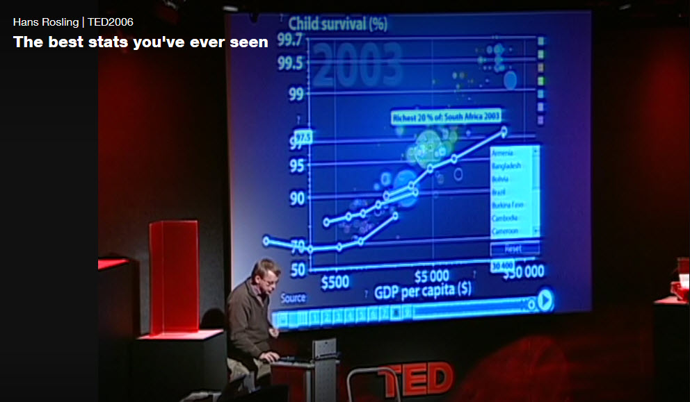
What set Hans Rosling apart is his apt observations of trends in data and the stunning way he presented them. Guaranteed: You’ve never seen data presented like this.
The key point here is that first, you must have the data, correct data, and then it’s what you do with the data that allows you to have an informed perspective of the ever-changing dynamic situations and be able to make the right decisions to make improvements.
The type of data, its quality, and form that it is in is key for data analytics interactive graphical visualizations:
Remember: first you must have the data. And that data needs to be in a form that can be accessed across all levels of analytic analysis. If you do not have the data, the correct data, or the data is a lock in a standalone flat file document that has no way of being cross-referenced with other documents, then you will fail. In Mr. Rosling’s case, if he did not have the data then he would not be able to use the very insightful analytics to reveal the trends in the data.
The typical status quo for Infrared Thermography:
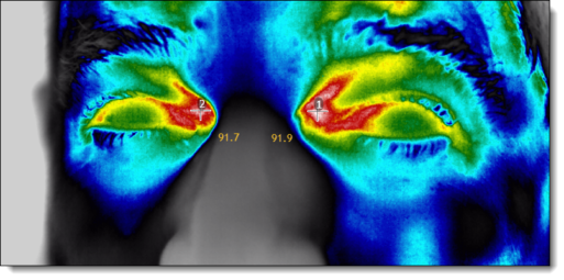
When it comes to Infrared Thermography programs for condition monitoring of facilities critical equipment, the typical data model is to lock the data in an “MS Word” document and saved as a PDF file. The problem with this approach is that there is no ability to get to the data/information in the files because they are all just segregated islands of information with no ability to look at the aggregate of key information and see any trends in a facility’s critical equipment. The data is only stored in static reports, “Flat Files” in terms of data management.
The right data?
There may be data in a CMMS (Computerized Maintenance Management System), but that data is designed around the needs of top-level management to understand what the economic feasibility of maintaining the facility, generating work orders, and what spare parts are inventoried. Although this data may have some value in the big picture and may be able to be accessed by a business analytics solution, it is only part of the picture and limited by how upper management and IT set it up. The other problem that you have is that all the really important data is still locked up in the Infrared Reports that are in MS Word or PDF files that you cannot access!
To have the correct data and be able to have access to it means that you need to start rethinking the process of how you collect the data, what data to collect, how to store the data, and how you will be managing it to have a solution that can be connected to a business analytics solution that lets you visualize your data and share insights across your organization.
When you watch the TED talk that Hans Rosling gives about The best stats you’ve ever seen, you will learn that the data was not easily accessible until he did data mining and connected it to a powerful data analytics solution that provides stunning graphics visualization that allows you to see trends in the data and gives you a point of reference to the information.
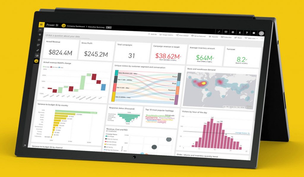
Your Infrared Program deserves the same perspective allow you to make informed decisions quickly. That is why at Colbert Infrared we use the Thermal Trend software that is a SQL based Relational database Management System or “RDBMS” to collect the data in the field, reconcile the data, and generate powerful reports that meet the standards for professional accountability of your infrared program. But to leverage this even further we are also able to connect, model, and explore trends in the data with the same business analytics solutions that provide powerful interactive graphics visualizations that you can use to make informed decisions quickly and collaborate with your staff.
“We will never stop trying to exceed our accomplishments, and we will never settle for just the status quo as others do. Our customers expect nothing less from us, nor should you.”
Learn more:
Here is the link to Hans Rosling TED talk: The best stats you’ve ever seen: or https://www.ted.com/talks/hans_rosling_shows_the_best_stats_you_ve_ever_seen
[psac_post_carousel show_author=”false” show_category=”false” show_date=”false” show_content=”true” design=”design-2″]